Katie Mae Moffat
Society, Politics and Culture - Editorial Portraits
Week One - Keir Starmer (Critical)
Initial Research
Things to be critical of Keir Starmer about:
- Shifting the Labour party to the right, shamelessly catering towards Tory voters. (Tory in fancy dress).
- Using Jeremy Corbyn as a scapegoat for antisemitism in the Labour party.
- Forbidding 'Labour' party frontbenchers from attending rail strikes, sacking Sam Tarry for attending and giving TV interview at picket.
Info to start with:
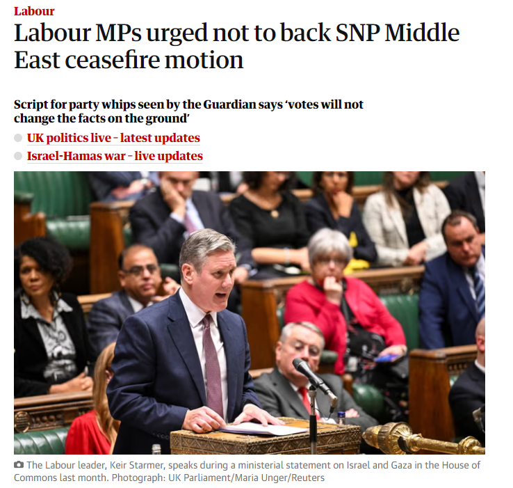
- Keir Starmer is facing a rebellion by as many as a dozen shadow ministers, who sources say are ready to resign rather than vote against calling for a ceasefire in the Middle East, which Starmer has refused to back.
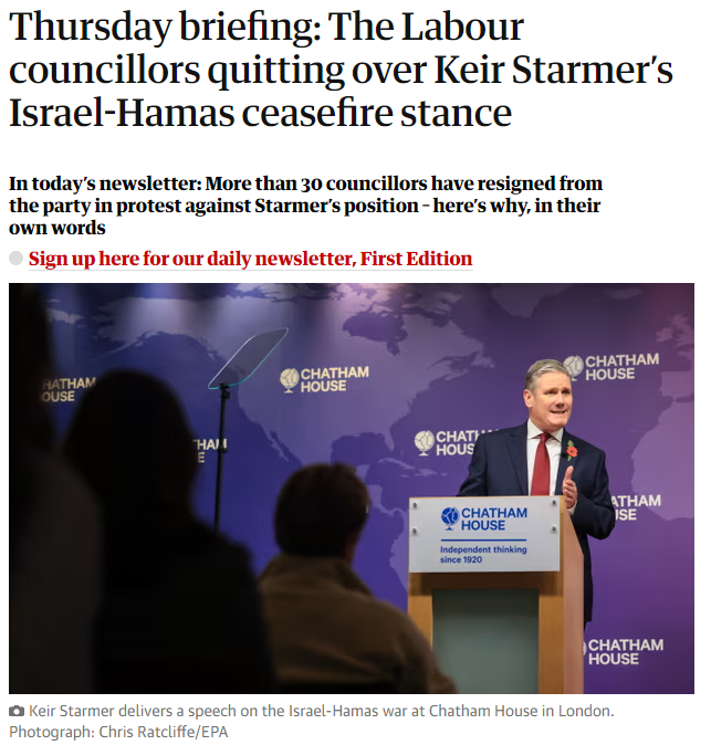
- 46 Labour councillors have left the party as a result of Starmer’s stance on Gaza
- Starmer angered many in his party when he told an interviewer last month that he believed Israel had the right to withhold electricity and water from civilians in Gaza.
- “If he [Starmer] called me right now, I’d give him a piece of my mind,” says Taj Salam, 57, a councillor of Little Horton, in the south of Bradford. “I’d tell him he’s in no position to lead the party that is meant to stand against oppression. I’ve been Labour since I migrated to Bradford in 1978,” says Salam, pictured above. “As soon as I started work, I started reading up on what party represented me and it was Labour. The party for working people, the party for people of colour, the party that would stand up for me and stand up against discrimination, do you know what I mean?“ It’s not any more,” he says. “Not calling for a ceasefire after 8,000 people have lost their lives, and a million people have been displaced, is inhuman.
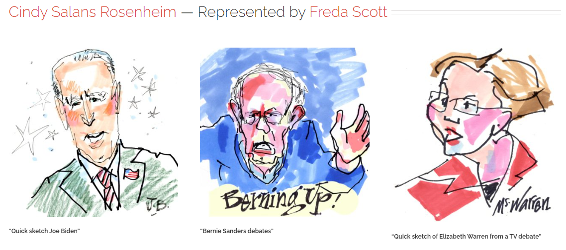
Editorial Portrait Examples
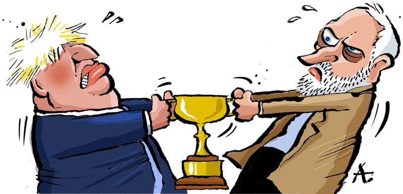
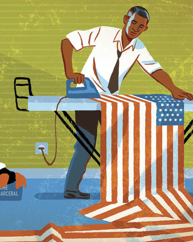
I like the quality of these, simply capturing the essence. Potentially good warm-up exercise.
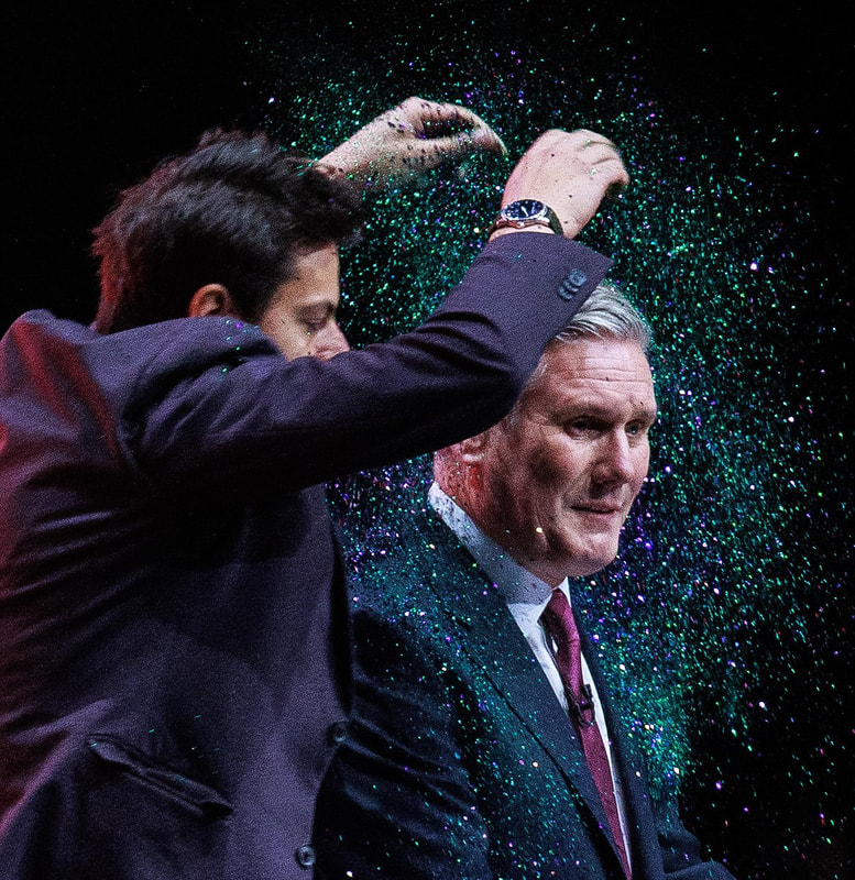
Assorted political editorial illustrations.
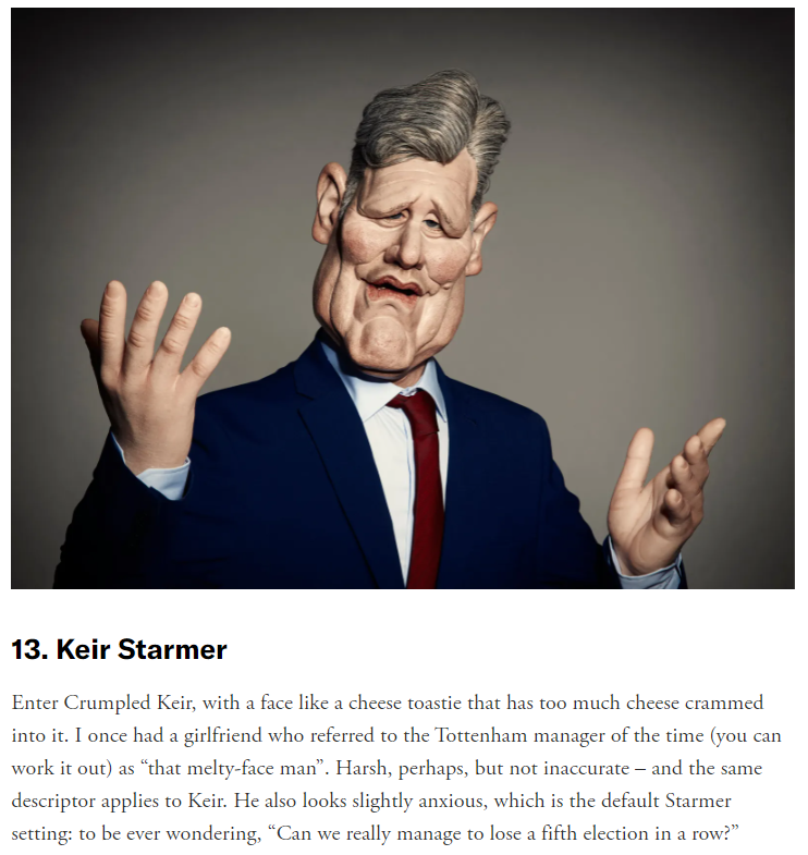
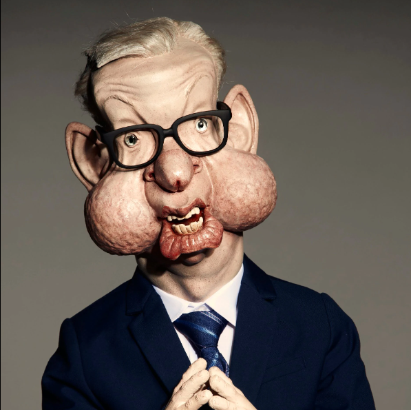
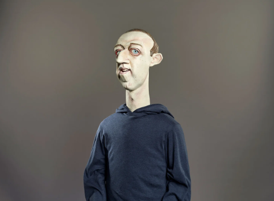
ITV's 'Spitting Image' revival.
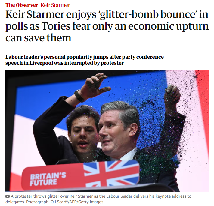
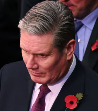
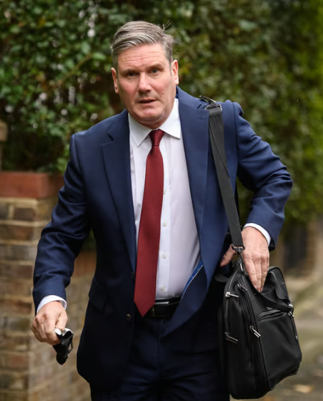
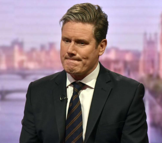
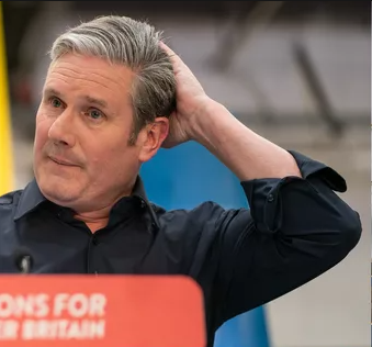
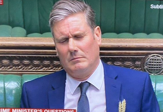
Starmer Portrait References
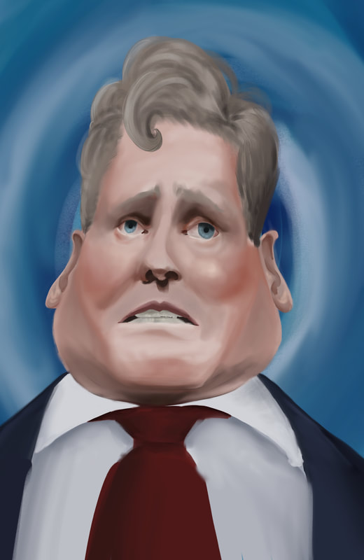
Key emotions/features: Shame, Fear, Worry, Nervousness, Concern, Embarrassment
Initial Visuals
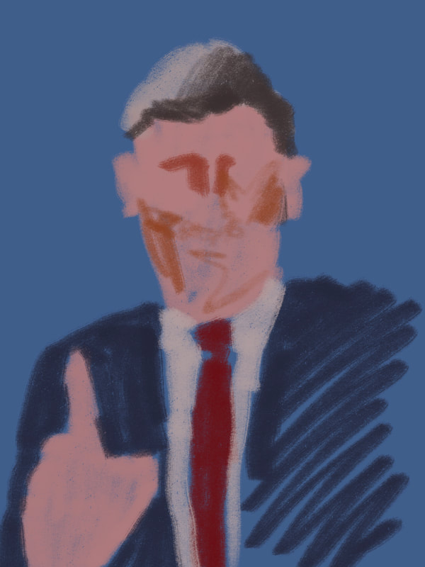
Trying to find a likeness, a colour scheme or a style I like. Not quite there yet. I like the composition/pose of the last sketch but it's very 50s drama, not modern. I also like the pose/colour scheme of the 6th last.
I'm not sure how to plan for these, If I'm supposed to thumbnail or just dive in and experiment. My process feels messed up and I need to get it back on track.
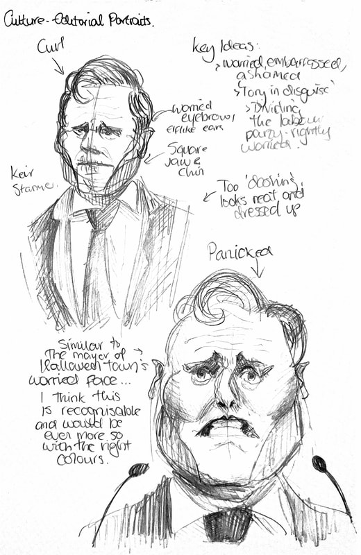
Is a portrait by itself enough to get the point across; what is the point? He doesn't have control over his party, he's often looking worried like he doesn't have faith in himself, he's going against his constituents' wishes, catering to centre to right voters. How do I portray that visually? Frantic, motion blur. Worry, specific angles, facial expressions, body language, 'Tory in disguise', literally wearing a mask? Not listening to his party members and constituents, how can I portray visually? Sketch these.
Is a portrait by itself enough to get the point across; what is the point? He doesn't have control over his party, he's often looking worried like he doesn't have faith in himself, he's going against his constituents' wishes, catering to centre to right voters. How do I portray that visually? Frantic, motion blur. Worry, specific angles, facial expressions, body language, 'Tory in disguise', literally wearing a mask? Not listening to his party members and constituents, how can I portray visually? Sketch these.
Sketchbook Development
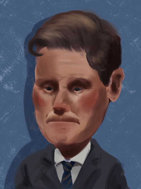
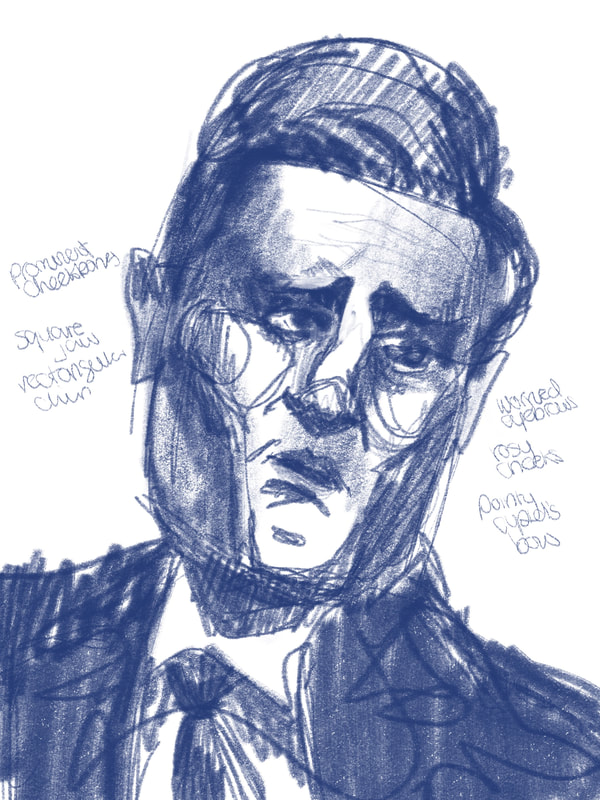
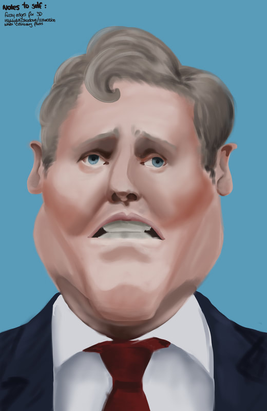
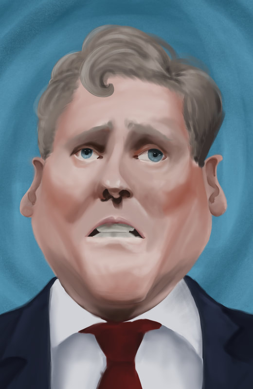
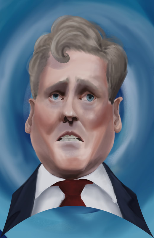
I like this angle looking up, with the extreme features, I think there's a sense of likeness but needs to be tidied up a lot. I'm going to expand on this one and hopefully take it forwards.
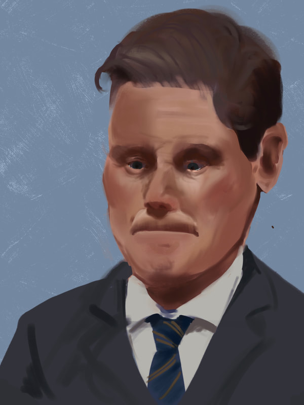
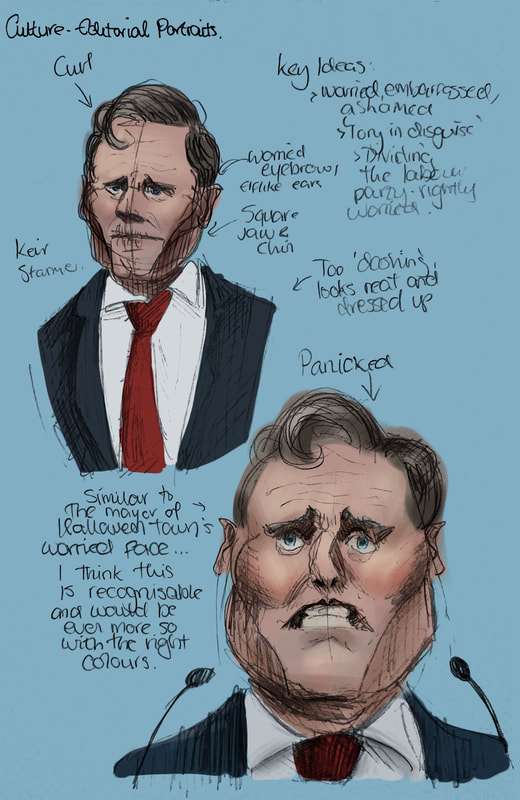
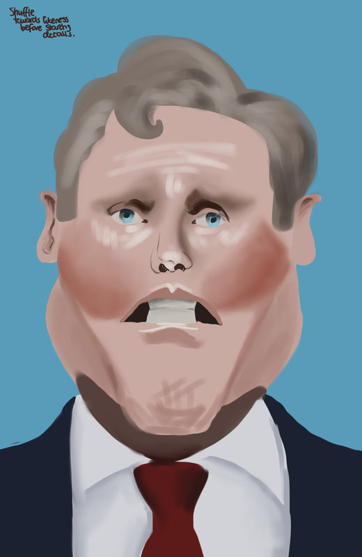
Developing this idea. Yet to add texture, just trying to get a likeness right now before I go in and render, add texture, put down the airbrushes for blending, figure out a background texture. Still not there with the likeness but it's getting closer.
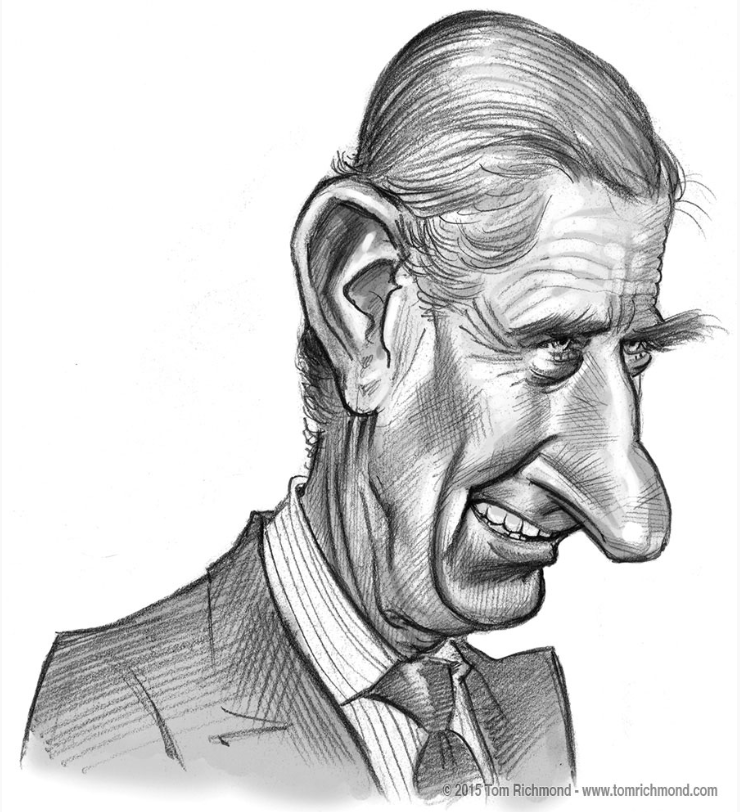
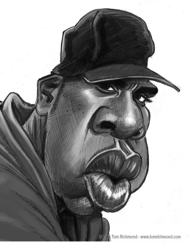
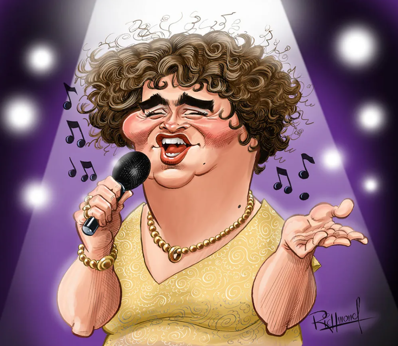
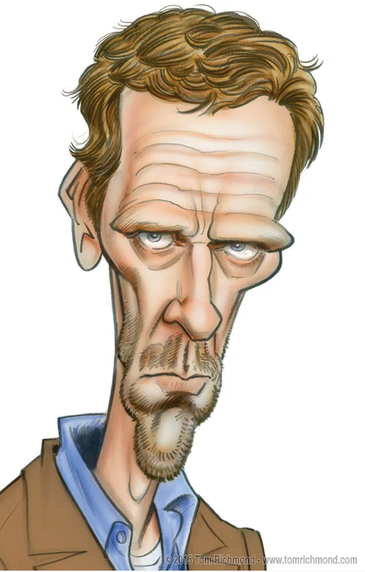
Tom Richmond
Looking more into how caricatures are done, how to capture likeness without completely sticking to the true anatomy, as I'm struggling to understand how it's possible...
Trying to find a likeness
The plan is to use the likeness as a base and add texture on top once I've got the shapes and tones I like. I might even add harsh lines on top to define shape and make it more tactile than 'airbrushy'.
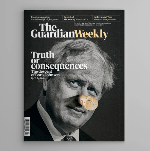
Existing Editorial Covers
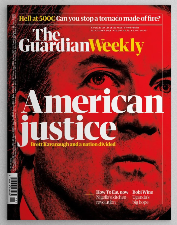
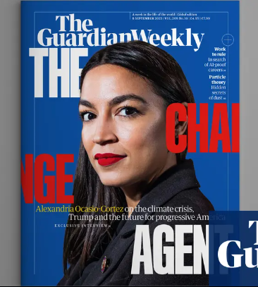
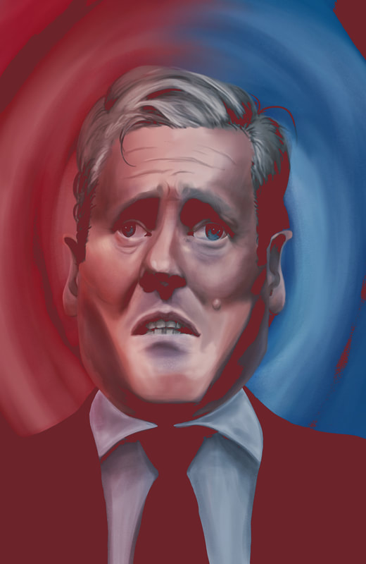
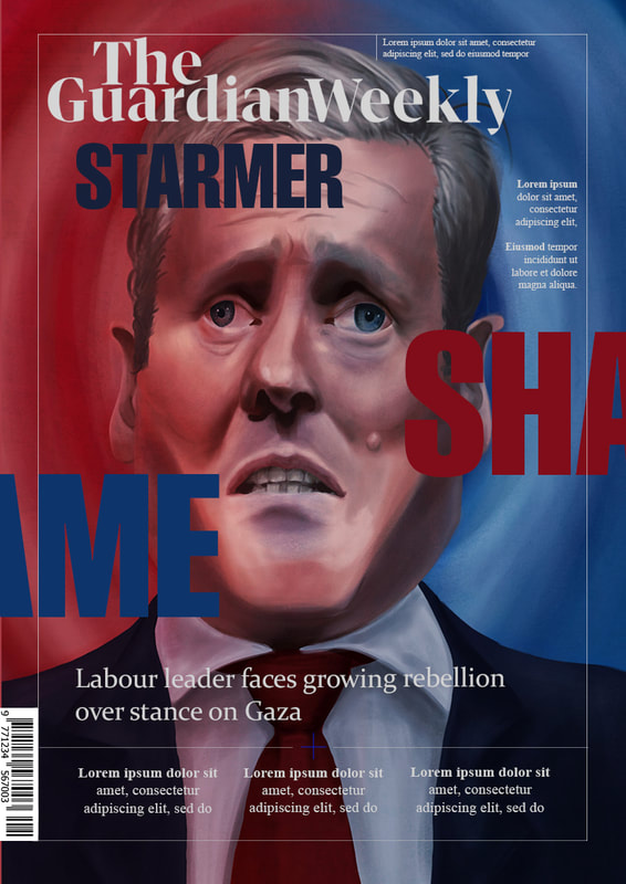
All for The Guardian. Paying attention to how type is used/how it overlays the image and doesn't get in the way, but interacts with the figure. Bold colours are pushed, colours are linked together, eg. the first one, with the cork colour and the type colour, or in the last, the type with her lipstick. All of these feature primary colours prominently. In AOC's case it's the colour of her party, with the word CHANGE representing the colour of the opposition. Brett Kavanagh is coloured entirely red, representing his party, but also evoking danger, especially when paired with the intense photograph, close up and looking into his eyes.
These make me want to push colour more, and think about how the type can play into my narrative.
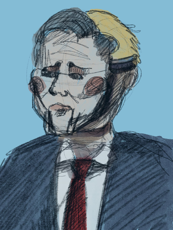
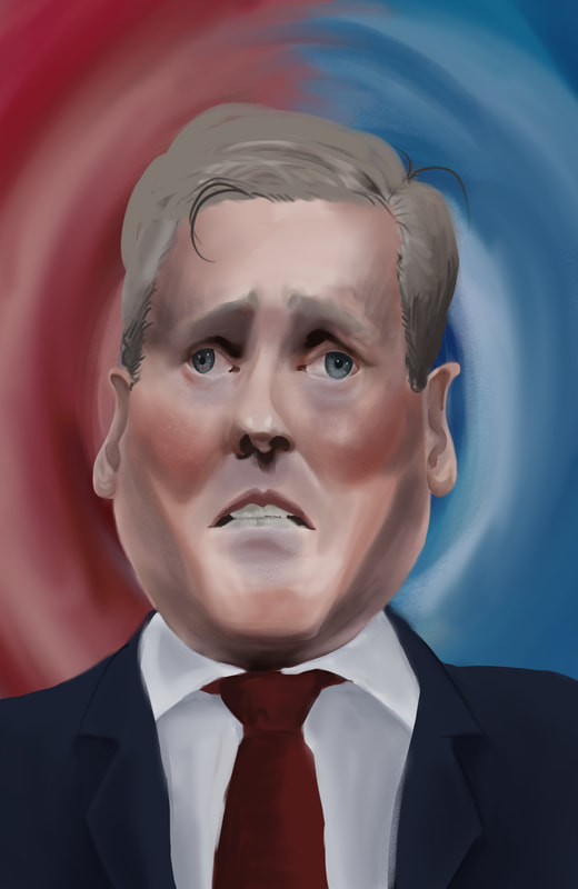
10 frontbenchers and 56 MPs total 'rebelled' against Keir Starmer in calling for a ceasefire in Gaza. Not quite enough to call it a 'split down the middle'. I could make reference to left and right. My idea is that Keir has not only split the party on this issue, but is trying to cater to left wing and right wing voters, and has shifted the Labour party much more towards the middle than previous leaders.
Tony's feedback to enact:
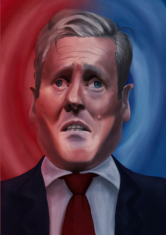
- Include details like Keir's mole, take out the curl and add some loose strands, hair texture from gel.
- Tone down the blue of the eyes, not a distinctive feature of his.
- Square out the head more - he has a noticeably rectangular head.
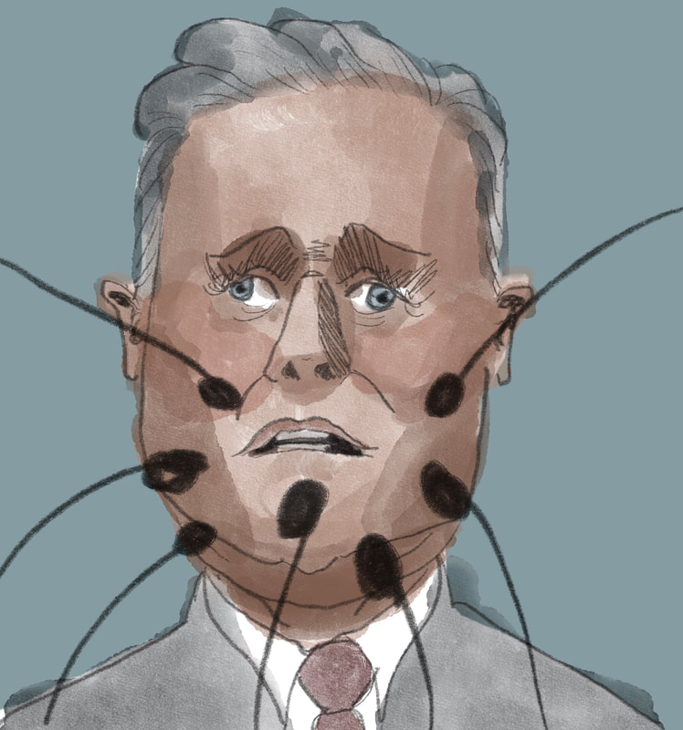
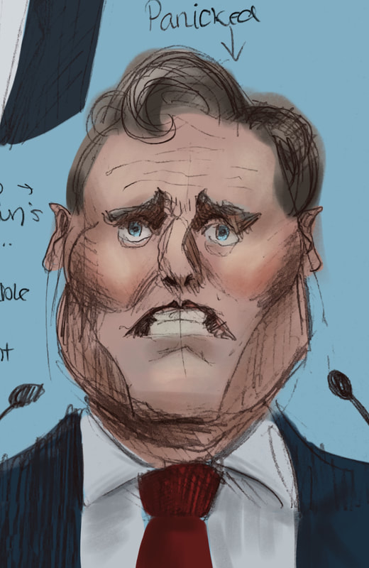
- Beads of sweat and forehead wrinkles to emphasise worry.
Dwayne's feedback:
- Carry forward lessons from previous projects, reflect and learn, don't abandon successes and failures, and don't be disheartened at not doing everything perfectly.
- Think about how I can mix in my digital work with the hatching/pen work/analogue skills I've developed.
Reset warps.
Detail Development
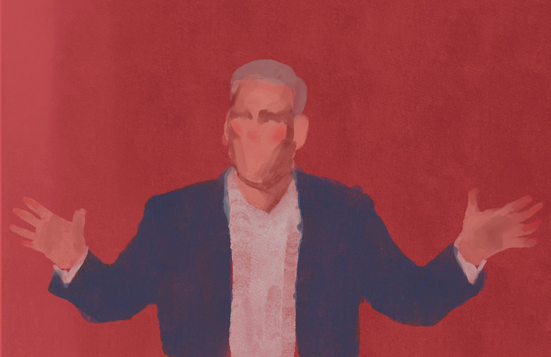
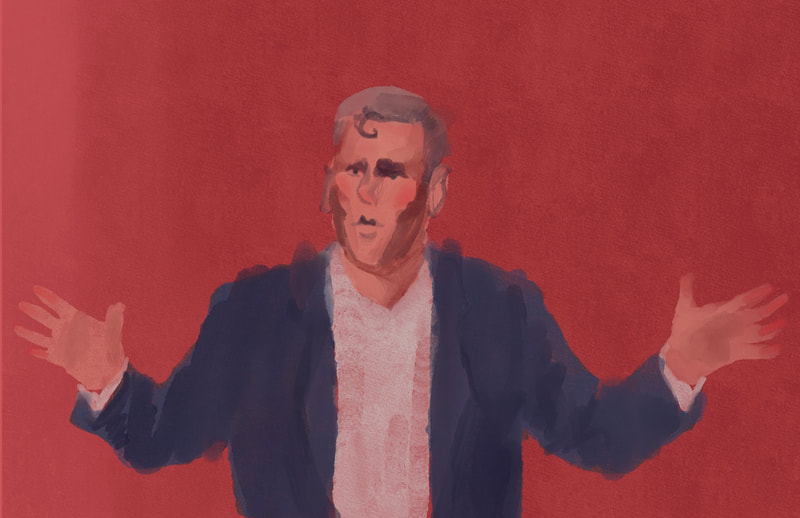
Base to first render.
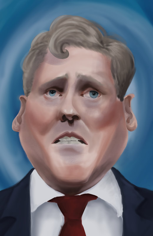
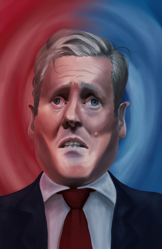
Notes for self - bring swirls in front of him - encased in it.
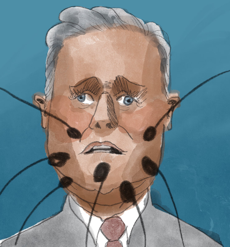
Increase level of detail, start bringing in different brushes and textures to give some visual range
Increase level of detail, start bringing in different brushes and textures to give some visual range
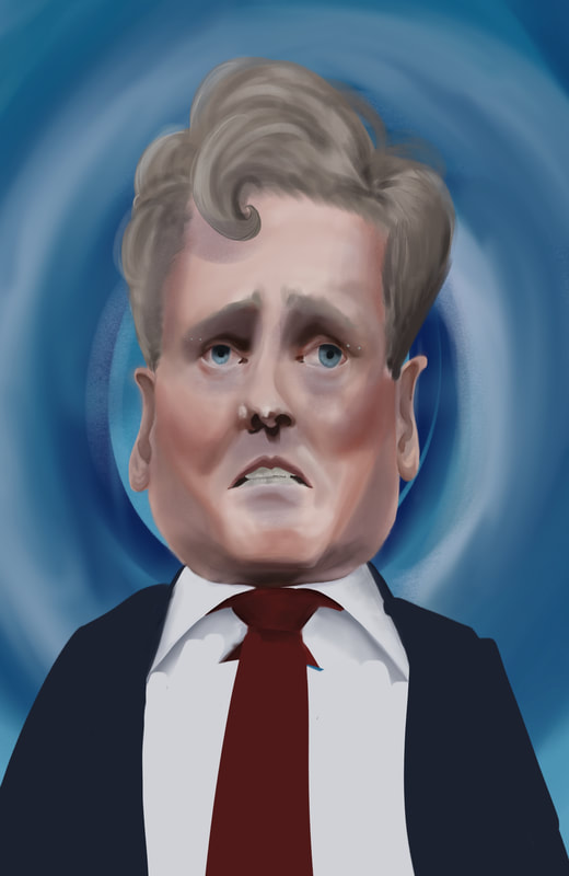
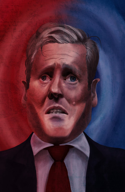
Final Illustration (So far)
With filters/textures
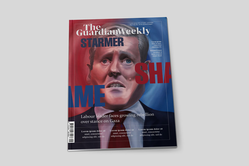
Mock-ups
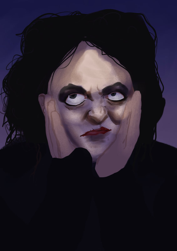
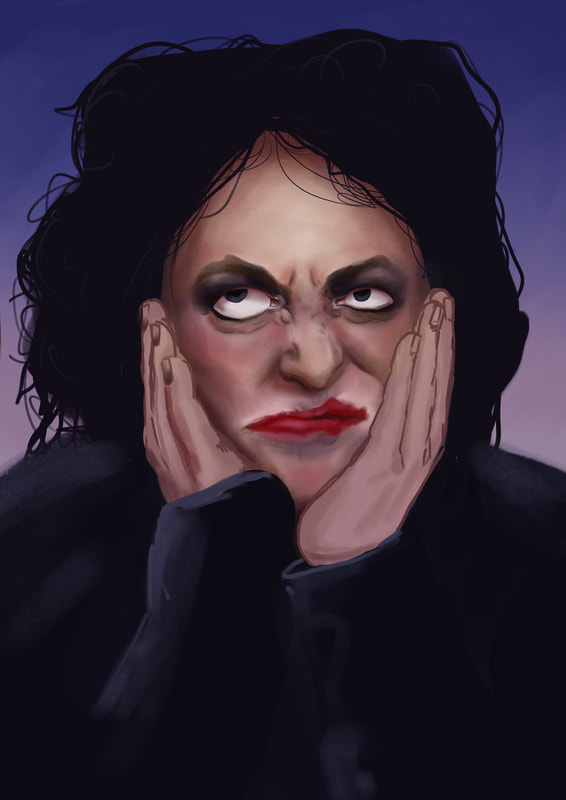
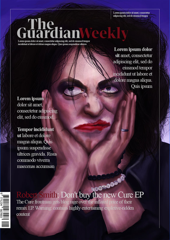
Week Two - Robert Smith (Celebratory)
Initial Research
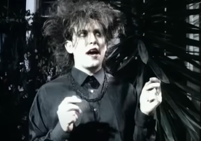
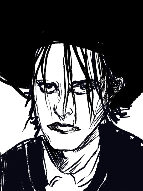
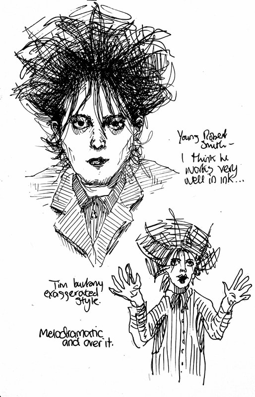
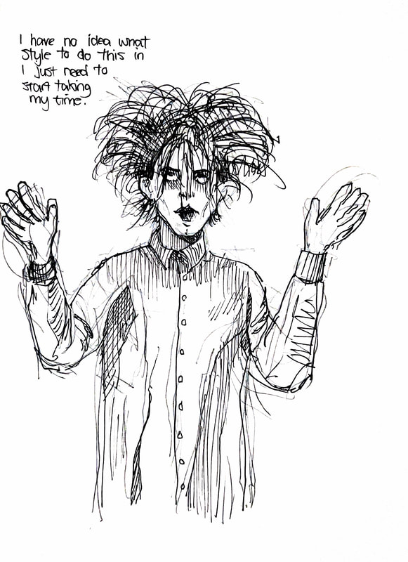
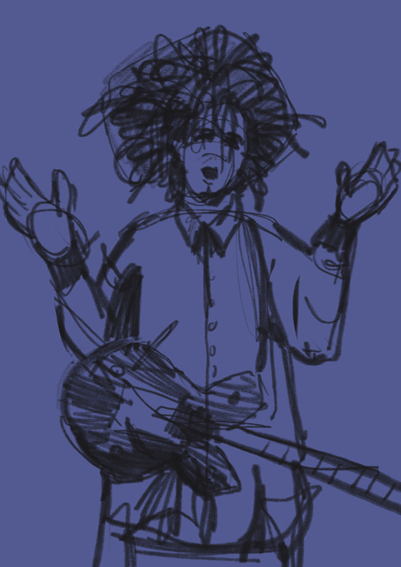
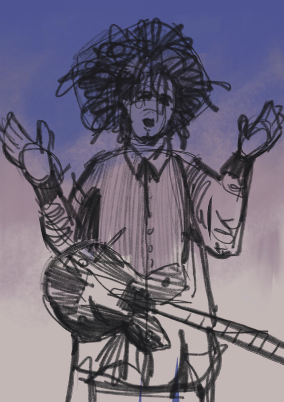
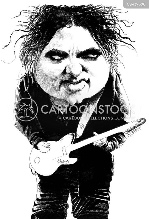
Robert Smith lends himself perfectly to ink drawing. Annoyingly, the portraits all have to have the same approach, which means either I do a digital drawing of Robert Smith, or I make two sets of portraits, ink and digital.
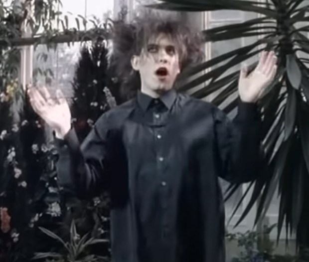
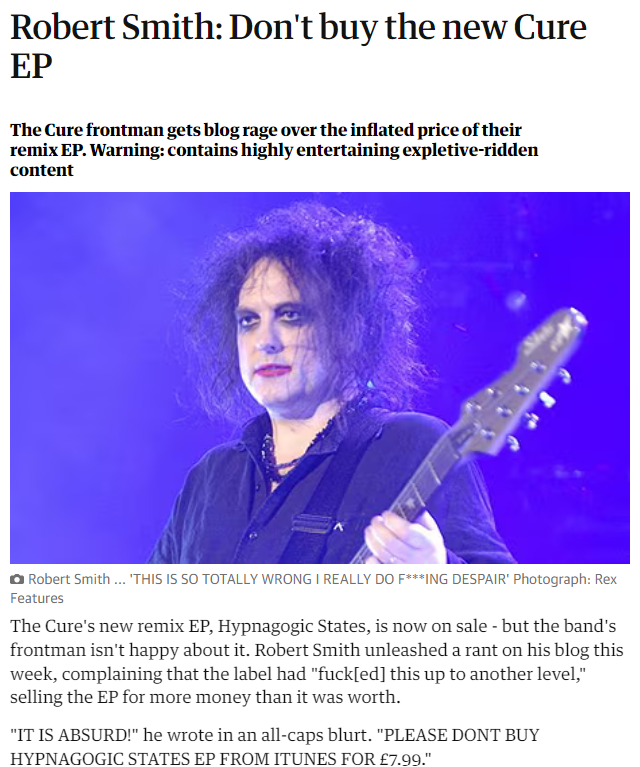
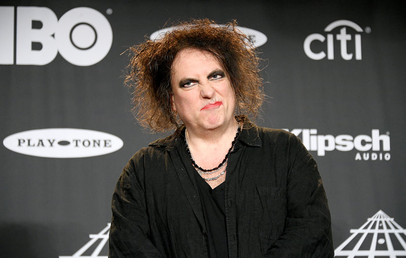
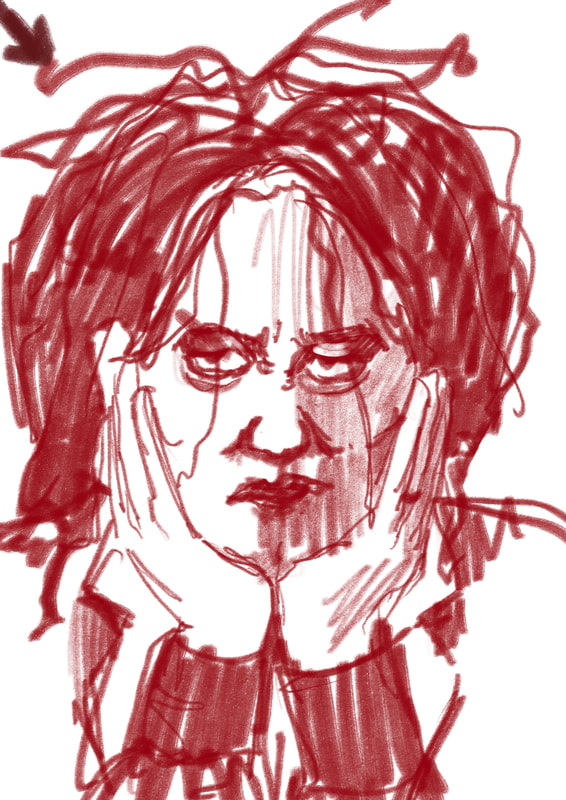
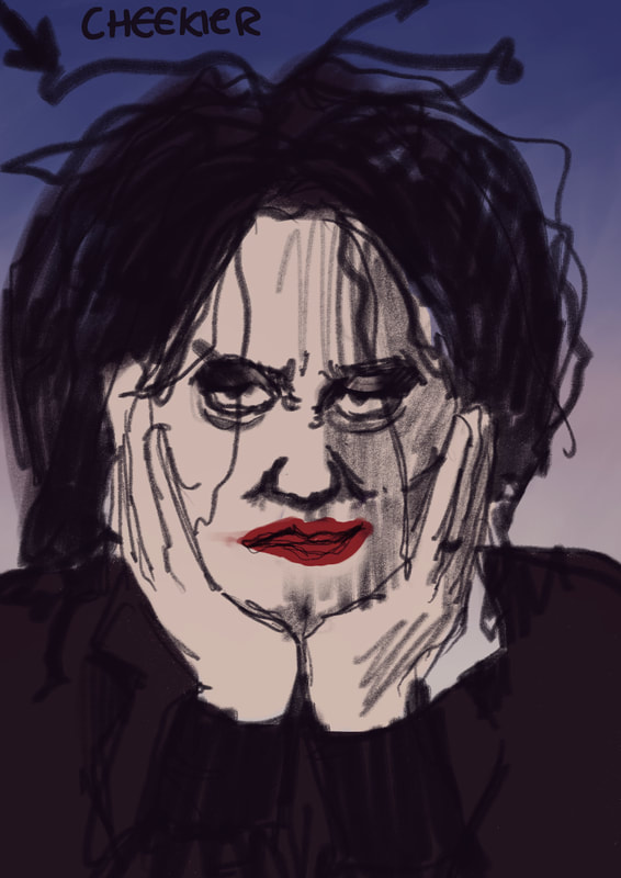
I'm finding it difficult to find an angle with Robert Smith, I had lots to say about Keir Starmer but all I have to say about Robert Smith is he's cool and I like his music. These articles all show him as someone who's a bit fed up with capitalism and the media, which I can get onboard with. Fed up/eyeroll expression could work.
Initial Tests - Digital
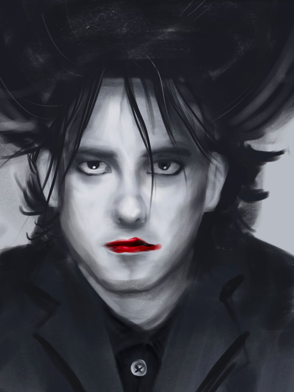
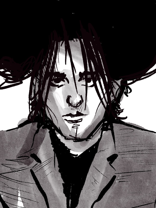
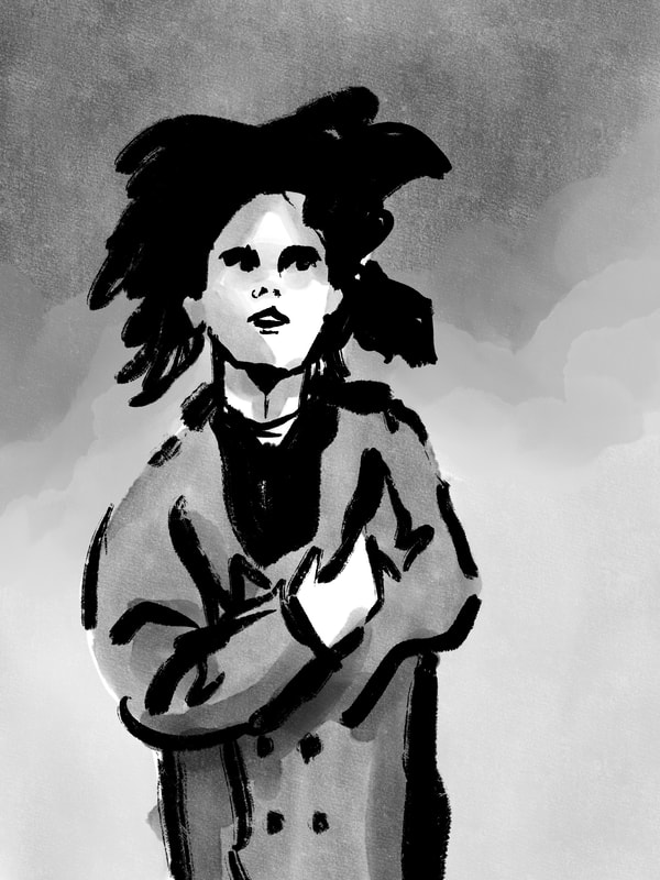
I like the pen drawing with the washes the most, style wise, but I feel like these are just drawings of Robert Smith and don't say anything in particular.
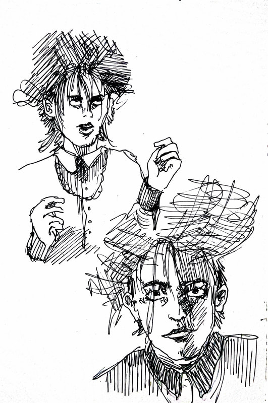
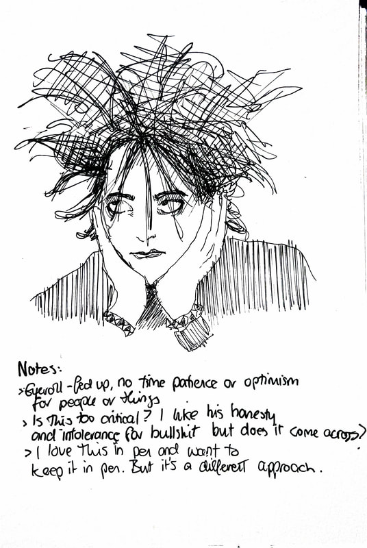
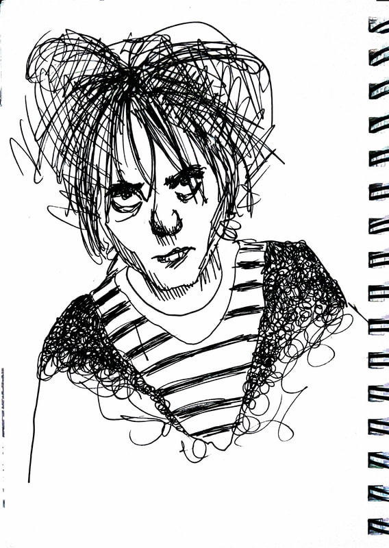
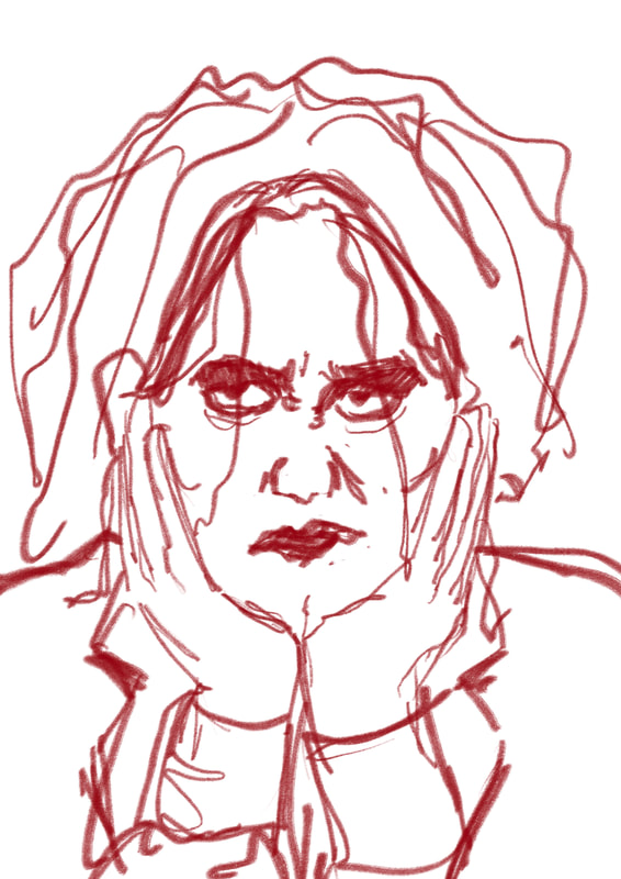
Initial tests - Sketchbook
If I'm celebrating Robert Smith's frankness and 'deadpan-ness', these mostly work well and have more emotion in them.
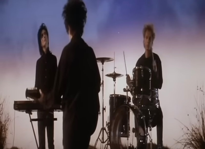
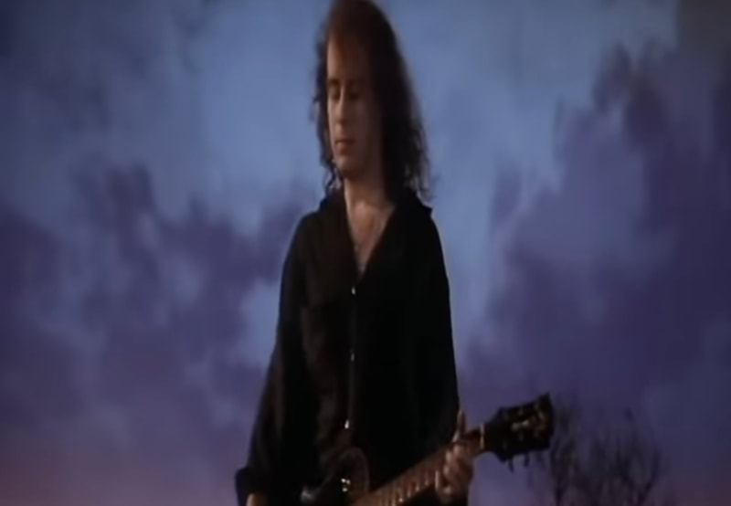
Colour/theme References
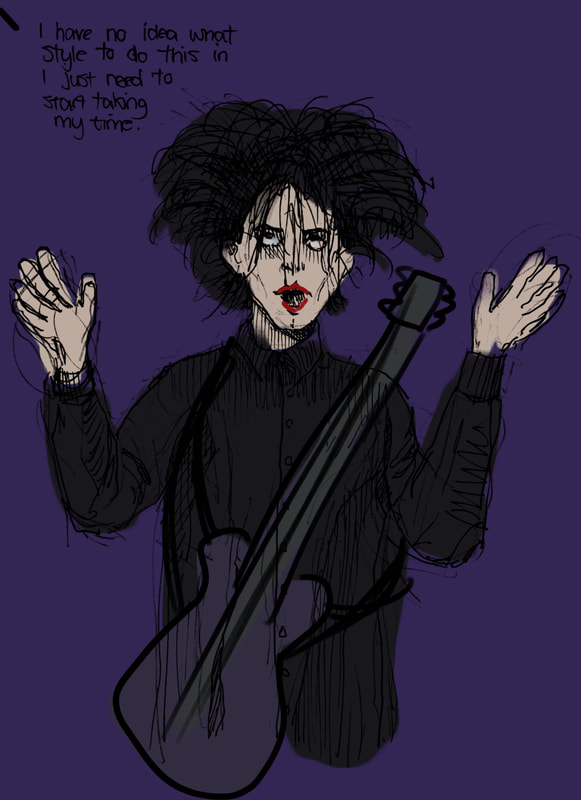
Digital Sketch
Revising Plan
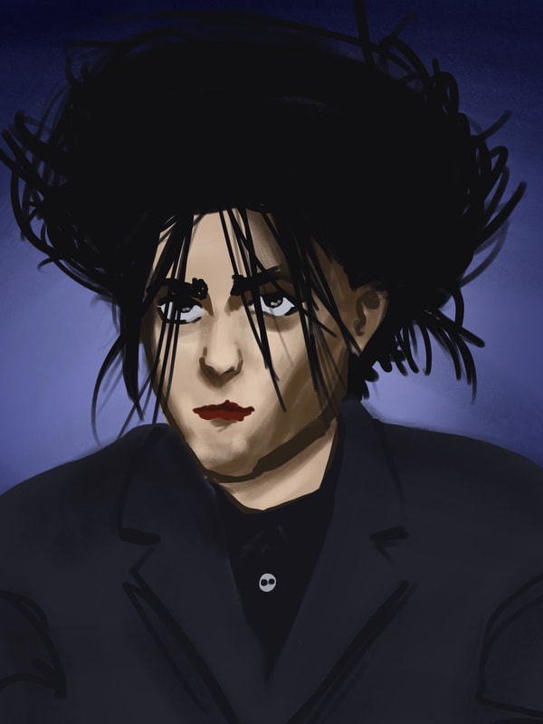
Tony recommended that I draw more recent Robert Smith and go into the level of detail I did with my Keir Starmer drawing so they can work as more of a set, and because my ink style doesn't lend itself too well to caricature
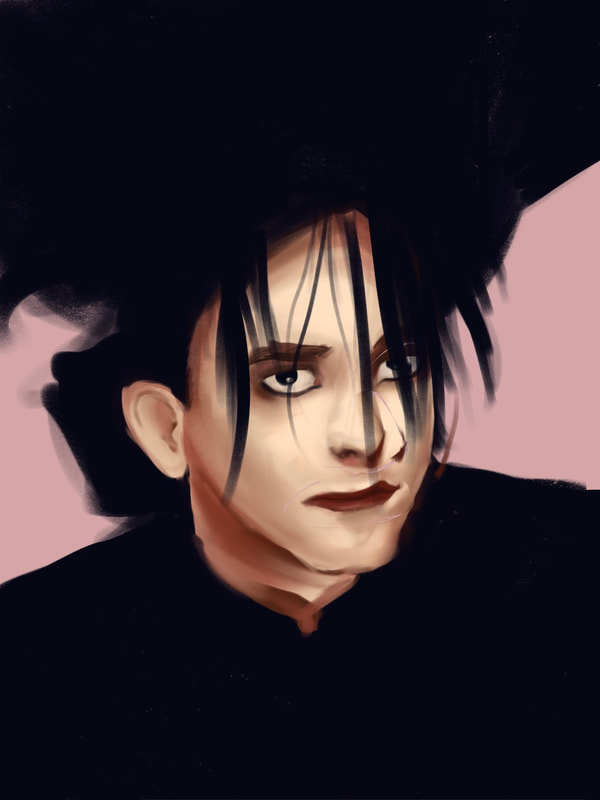
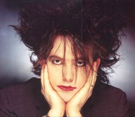
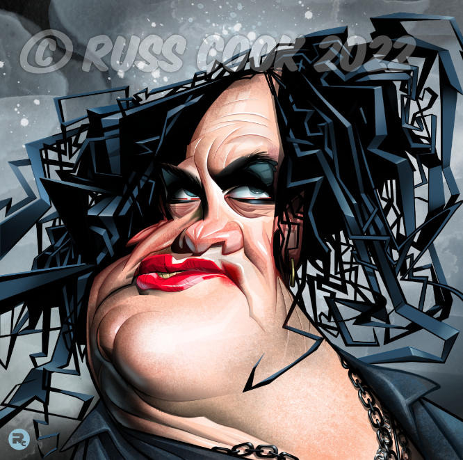
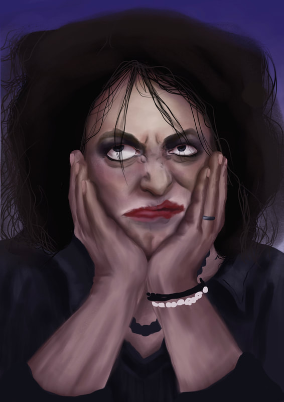
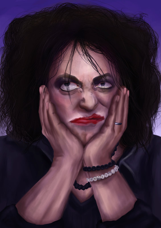
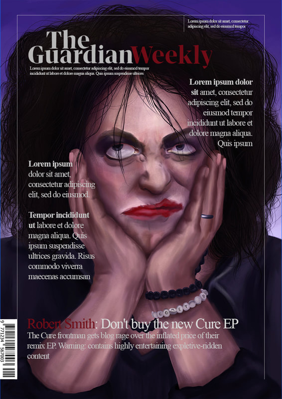
I'm going to stick with the same energy but close in on his phase to push his key features more: lipstick and hair, followed by the eyeliner.
Notes to remember:
I'm going to stick with the same energy but close in on his phase to push his key features more: lipstick and hair, followed by the eyeliner.
Notes to remember:
- Draw hair carefully so it doesn't end up looking like a hat.
- Remember key features, what do people think about when they think of Robert Smith.
- Celebratory approach.
- Should look like part of a set.
References
How faces work - eye scrunched on the scrunch side, lips and eyes pushed up at the corners by hands, hands meet in the middle for most support.
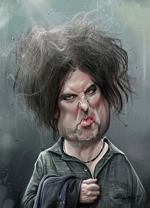
Existing Robert Smith Caricatures
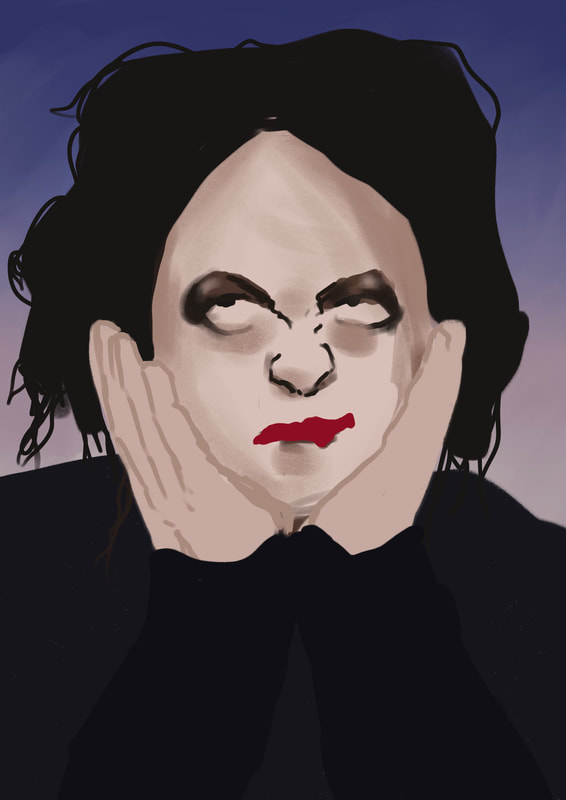
Development
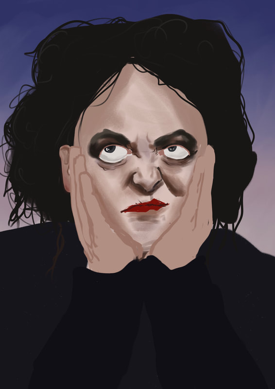
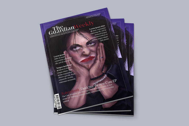
Final Illustration (So far)
Unfinished - needs texture added, arms and hands and shirt are still very airbrushed, I'm happy with the quality of the face.
Mock-ups
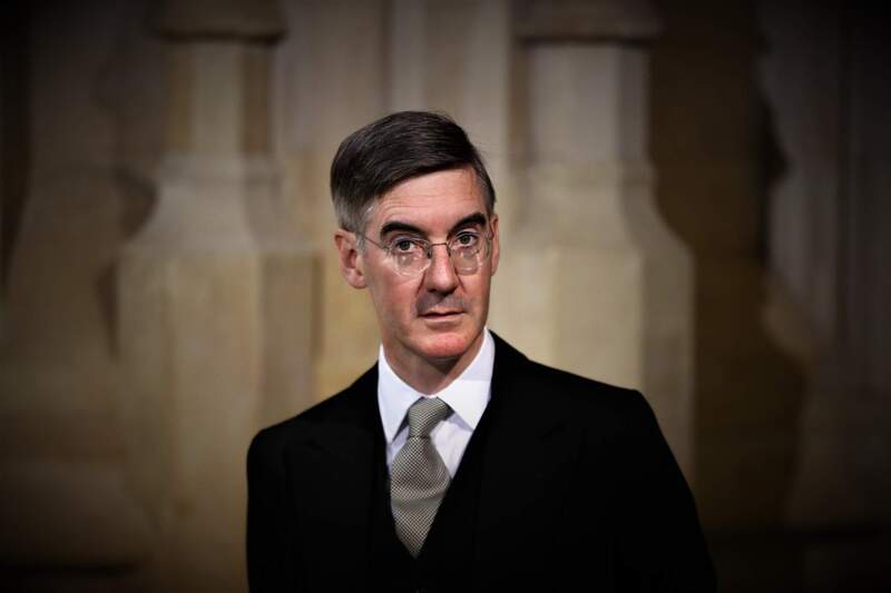
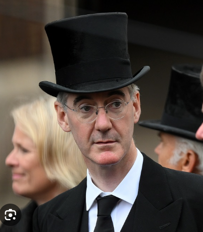
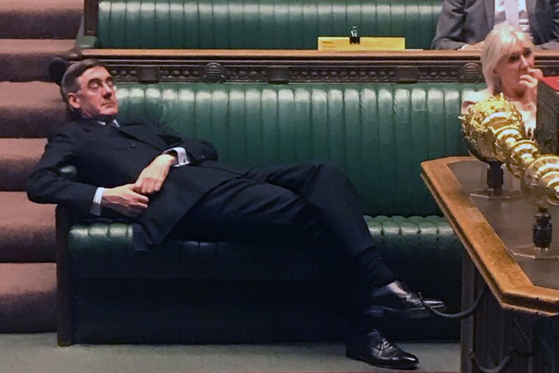
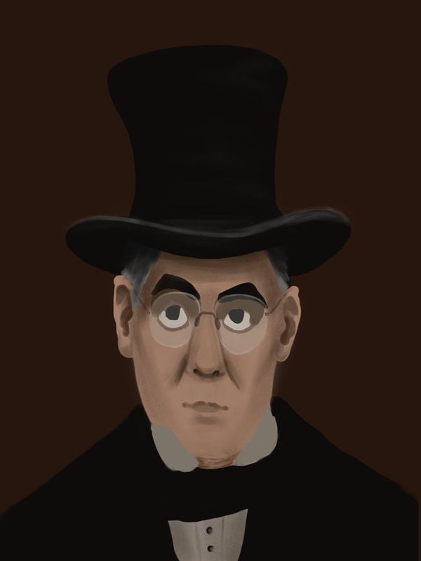
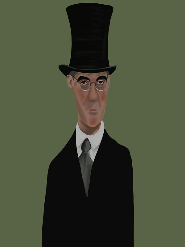
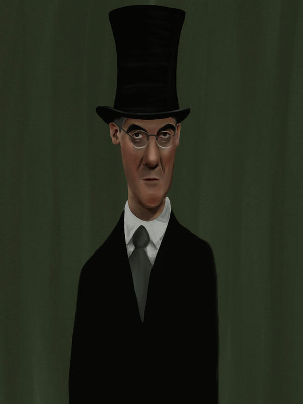
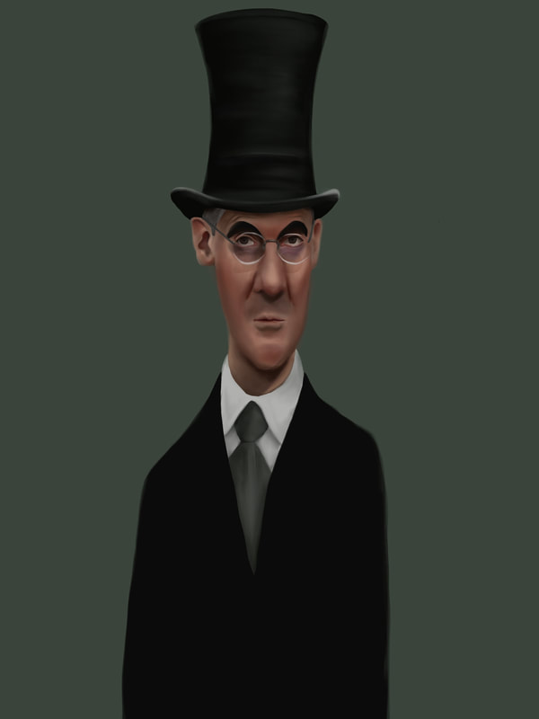
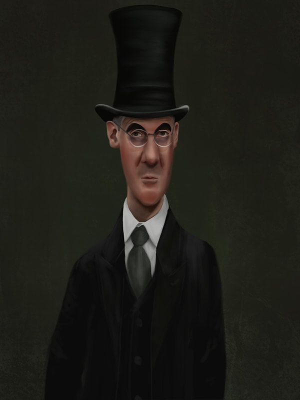
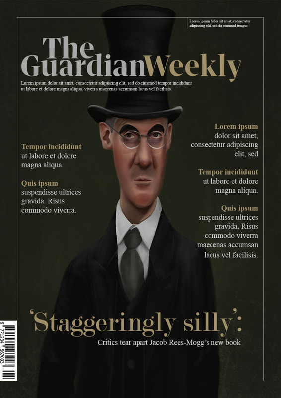
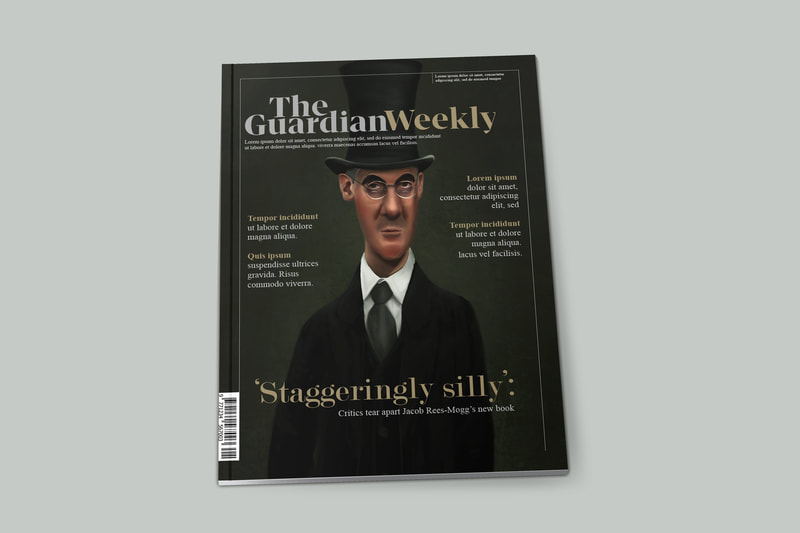
Week Three - Jacob Rees Mogg
Initial Research
Key info:
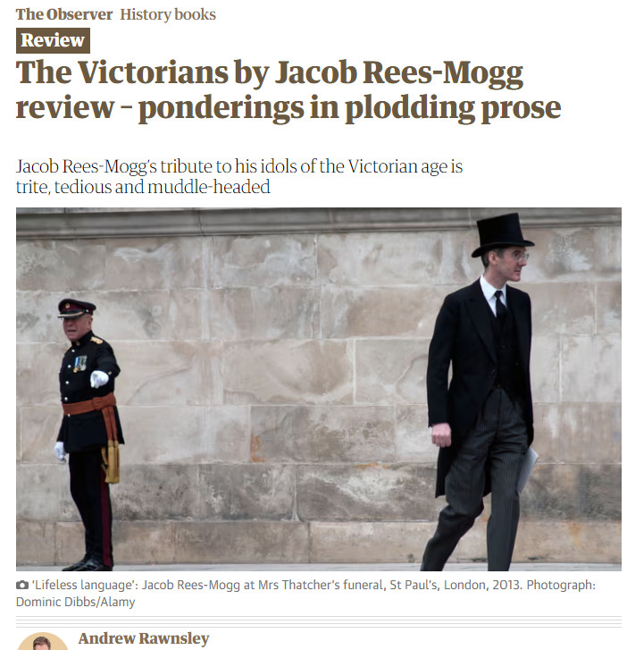
On his book 'The Victorians: Twelve Titans who Forged Britain'
His 'Titans'
- Thinks Victorian England was a time of political prosperity, ‘the honourable member for the 18th century.'
- High tory - Anti-abortion in all circumstances, anti same-sex marriage, climate change denier, thatcherite,thinks foreign aid is wasteful,
On his book 'The Victorians: Twelve Titans who Forged Britain'
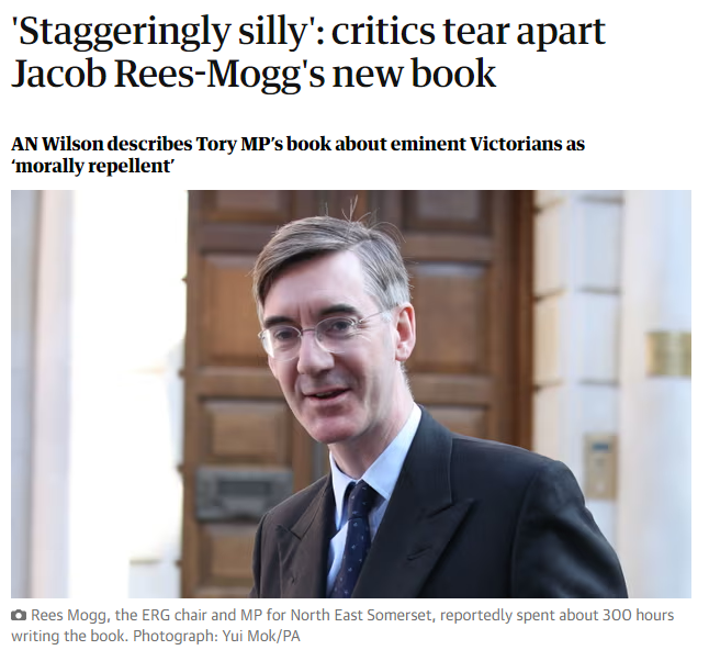
- The historian AN Wilson, whose book The Victorians was published in 2002, wrote in the Times that Rees-Mogg’s effort was “anathema to anyone with an ounce of historical, or simply common, sense”. Describing the work as “a dozen clumsily written pompous schoolboy compositions”, he said it claimed to be a work of history, but was in fact “yet another bit of self-promotion by a highly motivated modern politician”.
- “But there is just no denying it: the book is terrible, so bad, so boring, so mind-bogglingly banal that if it had been written by anybody else it would never have been published.”
- "If you want to read about the Victorians, AN Wilson, Simon Heffer, David Cannadine and Peter Ackroyd have all published acclaimed books. The only purpose of this dreadful pulp is to demonstrate why Britain’s past is no more safe in Jacob Rees-Mogg’s hands than its future."
His 'Titans'
- Viscount Palmerston, a sexual predator whom contemporaries nicknamed “Lord Cupid”. Rather than use the example of that important prime minister to tease out the hypocrisies and contradictions of Victorian moral codes, he hides behind the line that Palmerston had “a complicated and notorious private life”
- A chapter in praise of the “just and implacable” General Charles Napier, the conqueror of Sindh in modern-day Pakistan, collides with the hard fact that the legacy of this “heroic” and “benevolent” imperialist was a blood-soaked disaster.
|
|
|
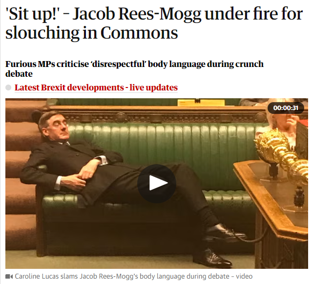
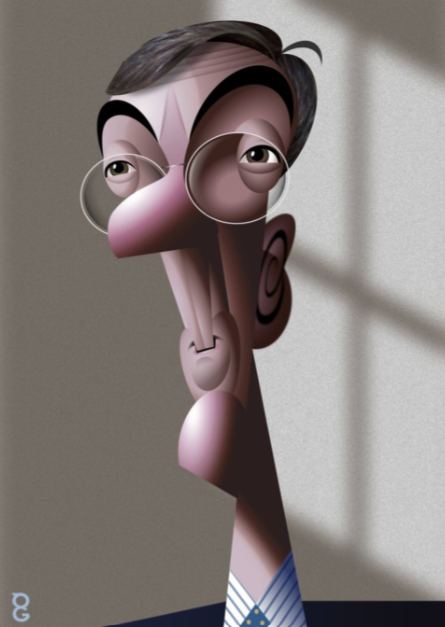
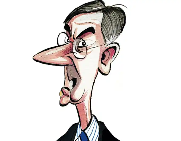
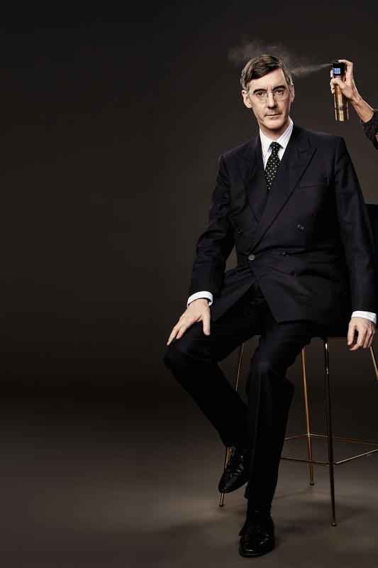
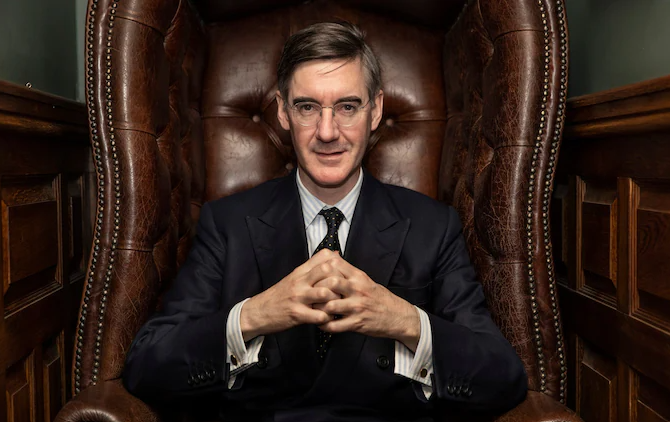
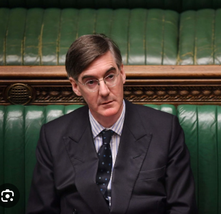
Existing Rees-Mogg Caricature
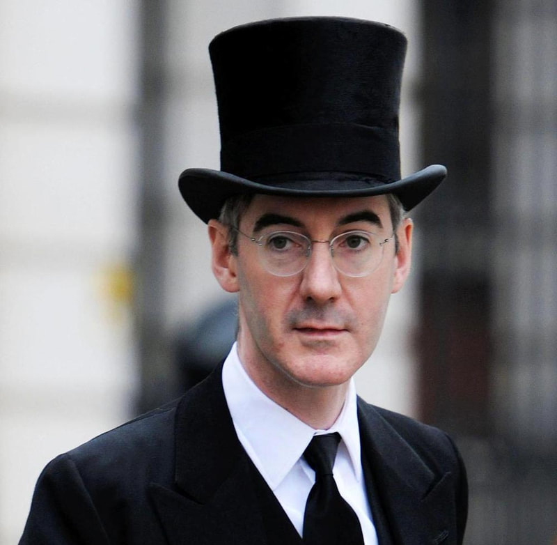
References
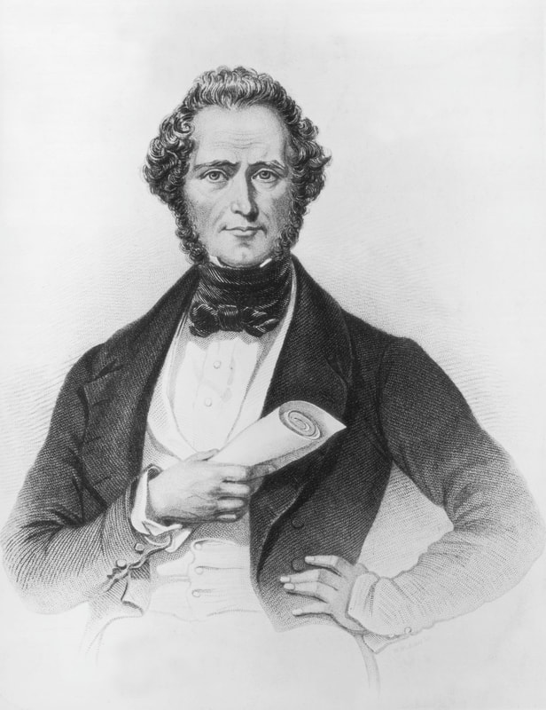
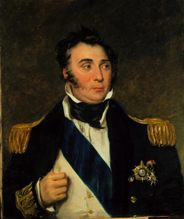
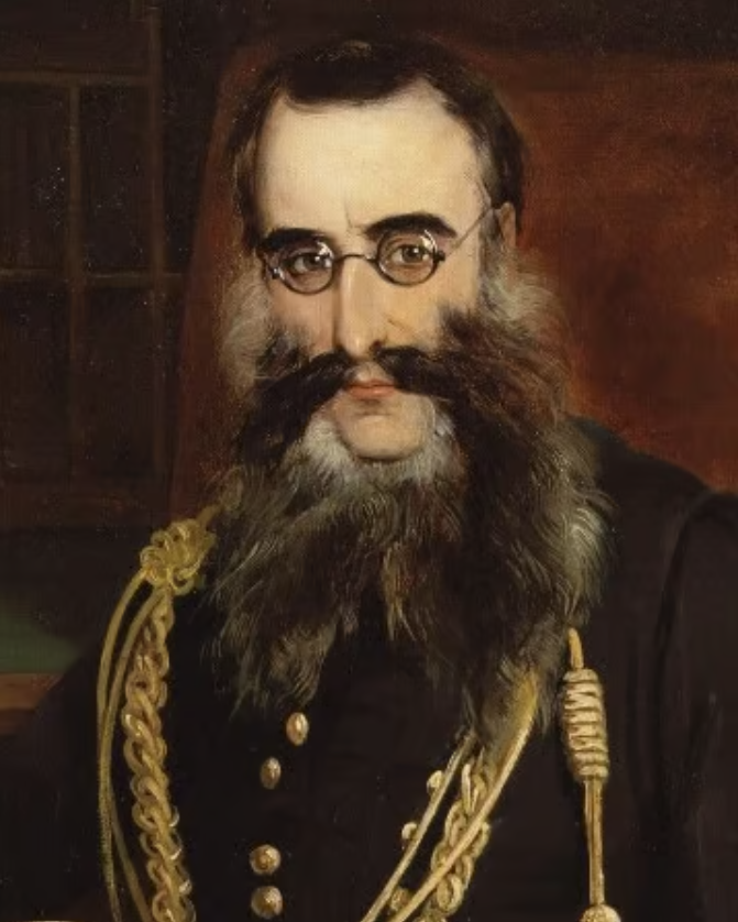
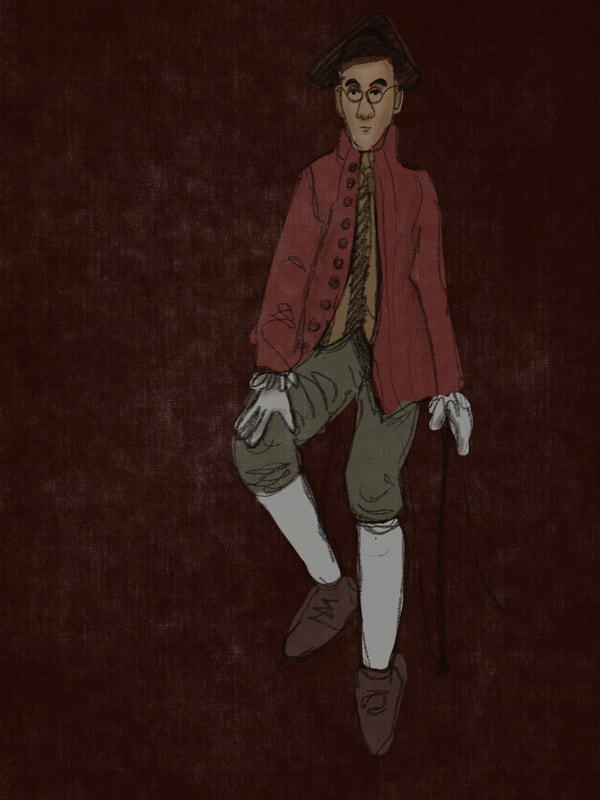
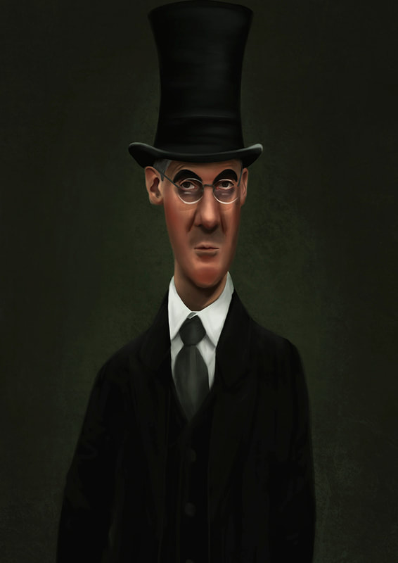
References of his 'Titans who forged Britain' to depict him as..
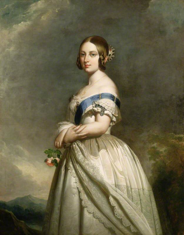
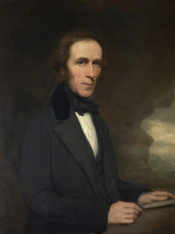
- Henry John Temple, 3rd Viscount Palmerston, Former Prime Minister of the United Kingdom
- General Charles Napier
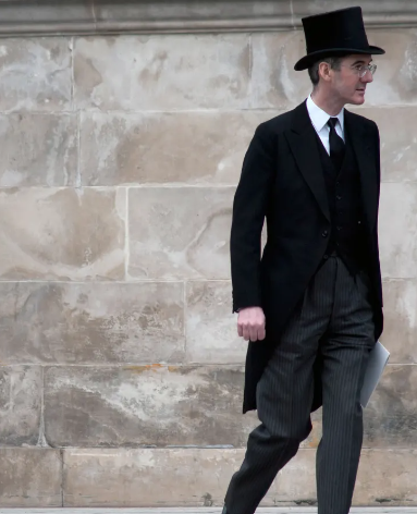
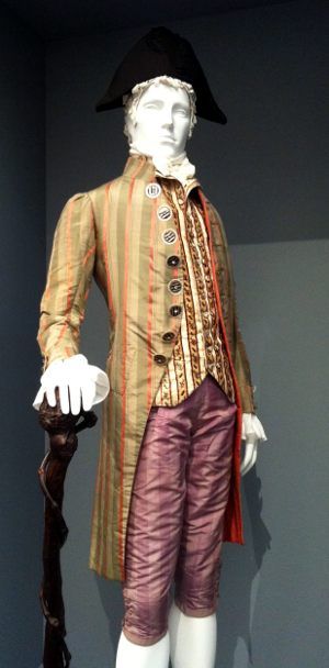
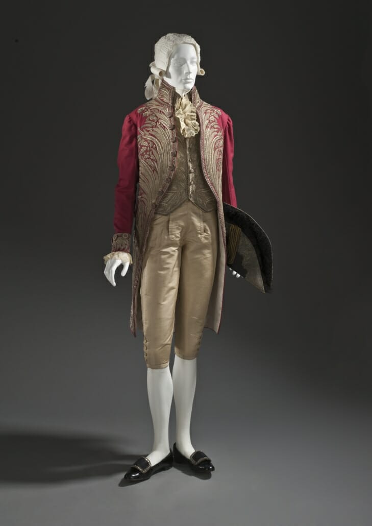
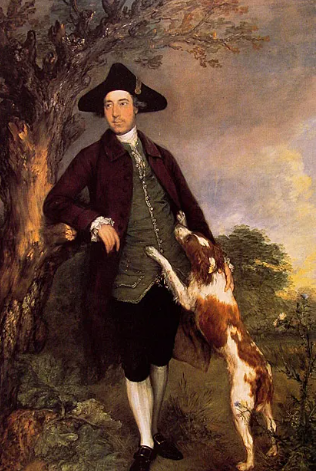
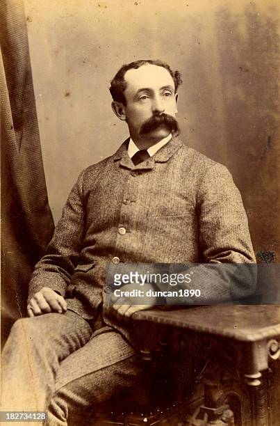
18th Century Dress
'Honourable member for the 18th century.'
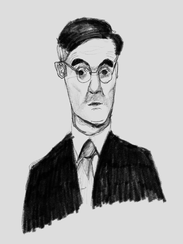
First Visuals
Notes:
- Should be a headshot then it will fit the best as part of the set.
- Same style or more painterly to match the era I'm going for?
- He looks like a mortician here, especially with the ghostly clouds..
Victorian Portraits
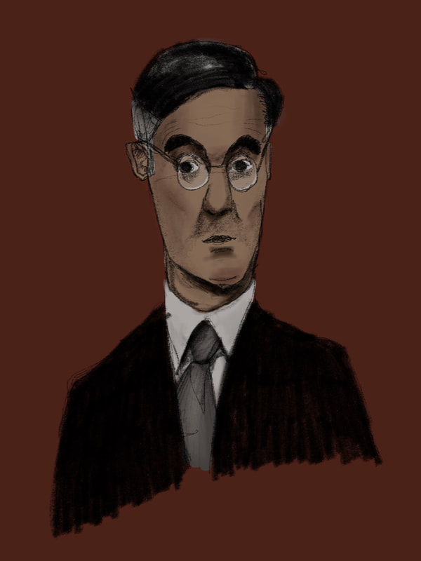
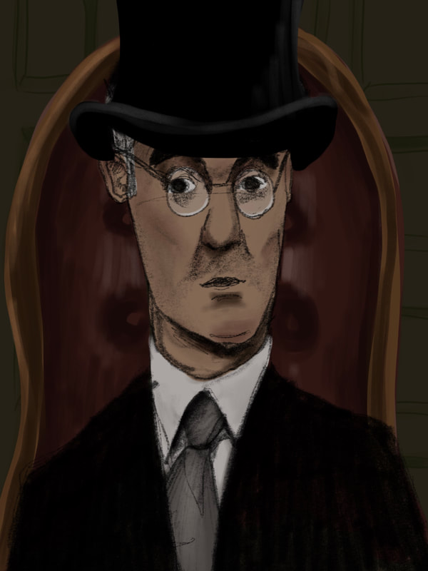
Development
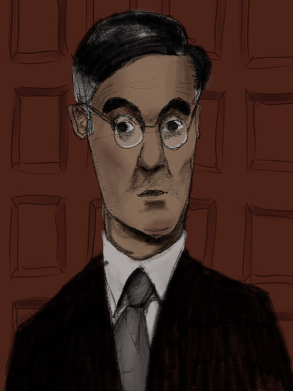
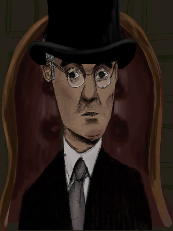
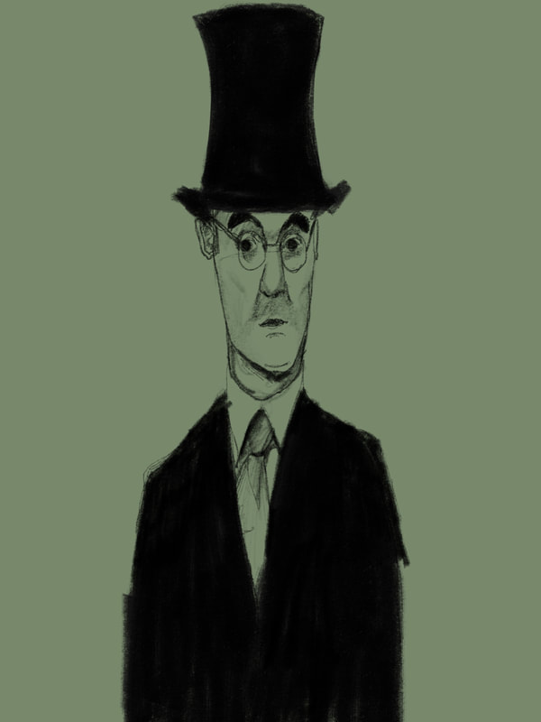
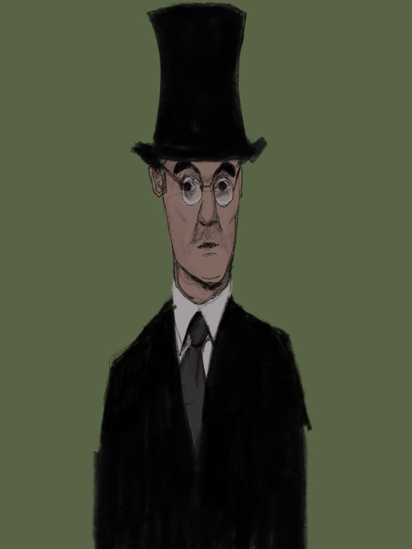
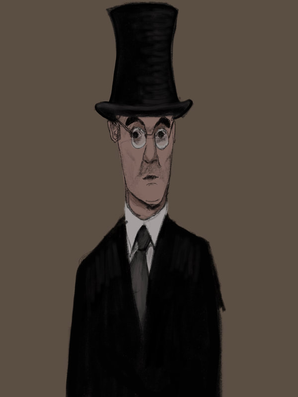
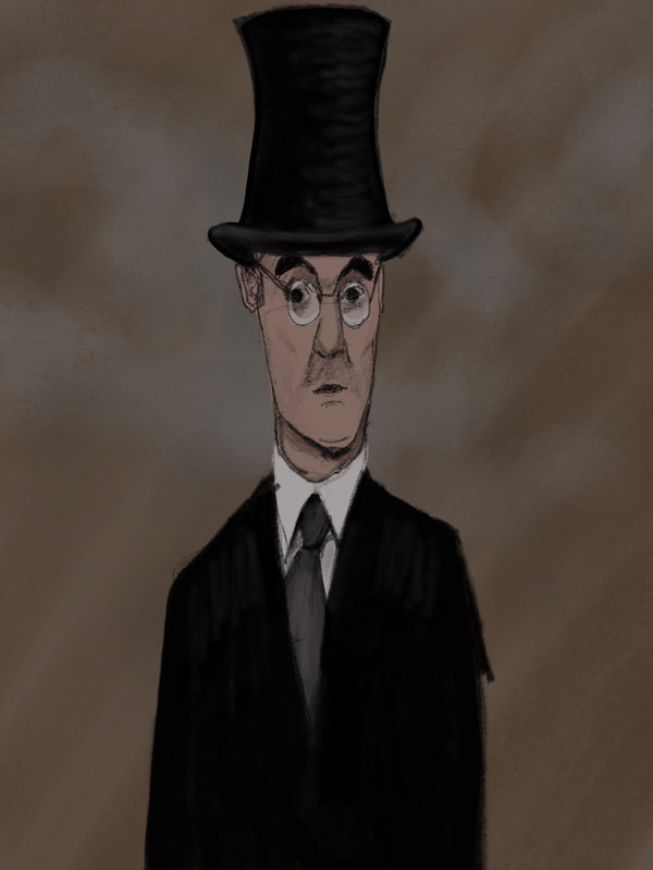
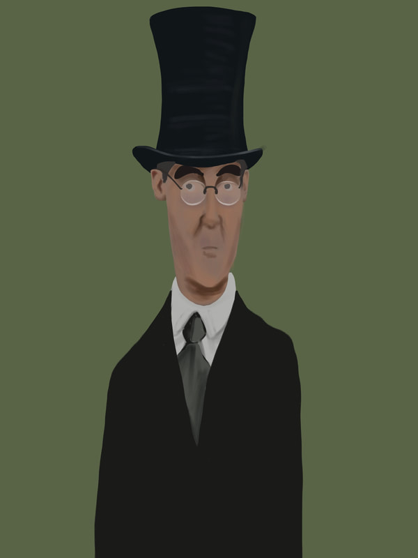
Final Portrait (so far)
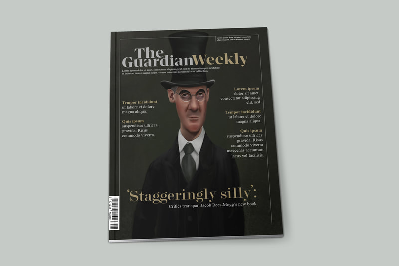
Mock-ups
All portraits
All Mock-ups
REFLECTION
I've thoroughly enjoyed this project, and have definitely harnessed skills I hadn't accessed too much before, which felt very fulfilling. I loved the drawing process, figuring out the likeness and the style of the caricature, finding which features to push, creating a story through the images. I think my process was streamlined and focused, and effective for the shorter time frame. For the other projects, I've had the full three weeks to make three outcomes, meaning a week and a half of research and idea generation. For these, I had a day or so of research and ideas, then straight into the illustrations. I found this process challenging, but also helpful as I didn't have the time to overthink ideas.
I'm facing a problem of choosing between my ink work and my digital work, or finding a way to combine them. I tried to combine them in my science project but I wasn't thrilled with the outcomes, and didn't enjoy the process too much either. I think the media work better on their own, as they're both elaborate and detailed. One option would be to split my second semester into multiple projects that would give me the opportunity to work on one project with each media-type.
I'm facing a problem of choosing between my ink work and my digital work, or finding a way to combine them. I tried to combine them in my science project but I wasn't thrilled with the outcomes, and didn't enjoy the process too much either. I think the media work better on their own, as they're both elaborate and detailed. One option would be to split my second semester into multiple projects that would give me the opportunity to work on one project with each media-type.
Site powered by Weebly. Managed by 34SP.com
